Analytics
Analytics that Deliver Insights
When you pair analytics with automation, you reveal real-time indicators, hidden trends and powerful insights that inform business decisions and make your organization smarter.
Robust, Real Time Reporting
Auto-generate meaningful status, forecasting and performance metrics to get a live look at the state of your business and client lifecycles.


Dynamic Dashboards
Quickest way to kickstart data-driven performance? Give every team member customized visibility to live data and task organization in their own dashboards.
Connecting your Data
See the big picture when you interrelate analytics across processes, projects, and departments while aligning teams with data consolidation.

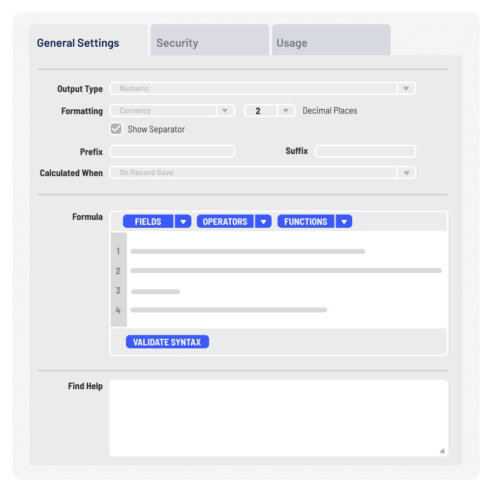
Advance Your Formulas
Dive into the analytical details with our advanced formulas, which help you explore trends, breakdown contextual scenarios and predict future performance.