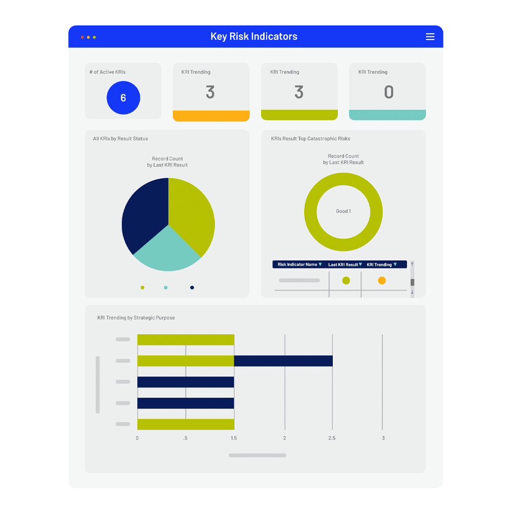
“Real-time status monitoring? We had none. We had to pull reports out of Access or look at individual spreadsheets. Any sort of consolidated reporting and metrics aggregation was coming from multiple sources. Sometimes that took days.”
Financial Services – Business Resiliency
|
Updated:
|
Published:
