Creating Insights from Geographic Data

How point maps improve your reporting
Where are the majority of your customers located? Do you need to find out if there’s a particular area where your sales are higher or lower? Is there a cluster of your high-risk vendors? Visualizing this kind of data is essential to understanding patterns and trends for your business.
In Onspring, you can create point map reports based on geographical locations, and when an address record is updated in the record, it’s also updated on the map in real-time. In this post, we’ll give you a brief overview of how data visualization in point map reports work in Onspring.
What Are Point Maps?
Point maps are exactly what the name implies: points on a map just like Google Maps. Onspring’s point map data reporting feature helps businesses and organizations manage location-based data efficiently. You can use point maps to visualize Vendors by headquarters, Incidents by place of occurrence, Assets by location, and Users/Contacts by home or office addresses.
This type of geographic data report enables you to visualize information typically displayed in trend graphs, bar charts, pie charts, and more. Simple reporting features like point maps are just one of the examples of how Onspring provides you with an easy method to make sense of your most crucial business data.
How Point Maps Work in Onspring
A geocoding element in Onspring enables you to create point map reports for any data records that contain address information. The Onspring point map data feature takes location-based data or address-based fields from an application you specify within Onspring to build a visual report using geocoded addresses to create dots or points on a map.

You can specify the street address by customer or vendor business, home, personal, etc., simply by using the fields in an Onspring form. Remember, because Onspring is a no-code platform, you can determine which records to map and create a point map report in minutes, just like any other chart or calendar report.
Using Tool Tips on a Point Map
With Onspring point maps, you can also decide which pieces of information appear in a tooltip when a user hovers over a point on the map, such as contact name, sales volume, and more.
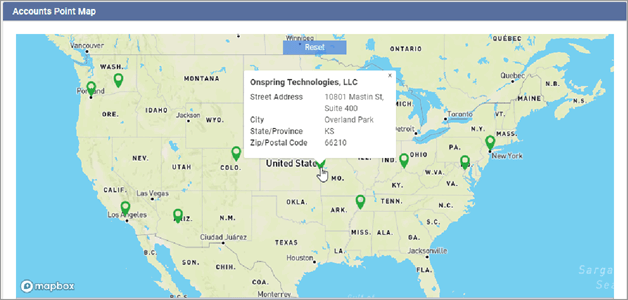
Onspring’s geocoding system will add latitude, longitude, and a geocoding precision field to your location records. Point map reports can be customized to emphasize specific data points.
- Each point on the map may have a tooltip showing its field value and an optional record link
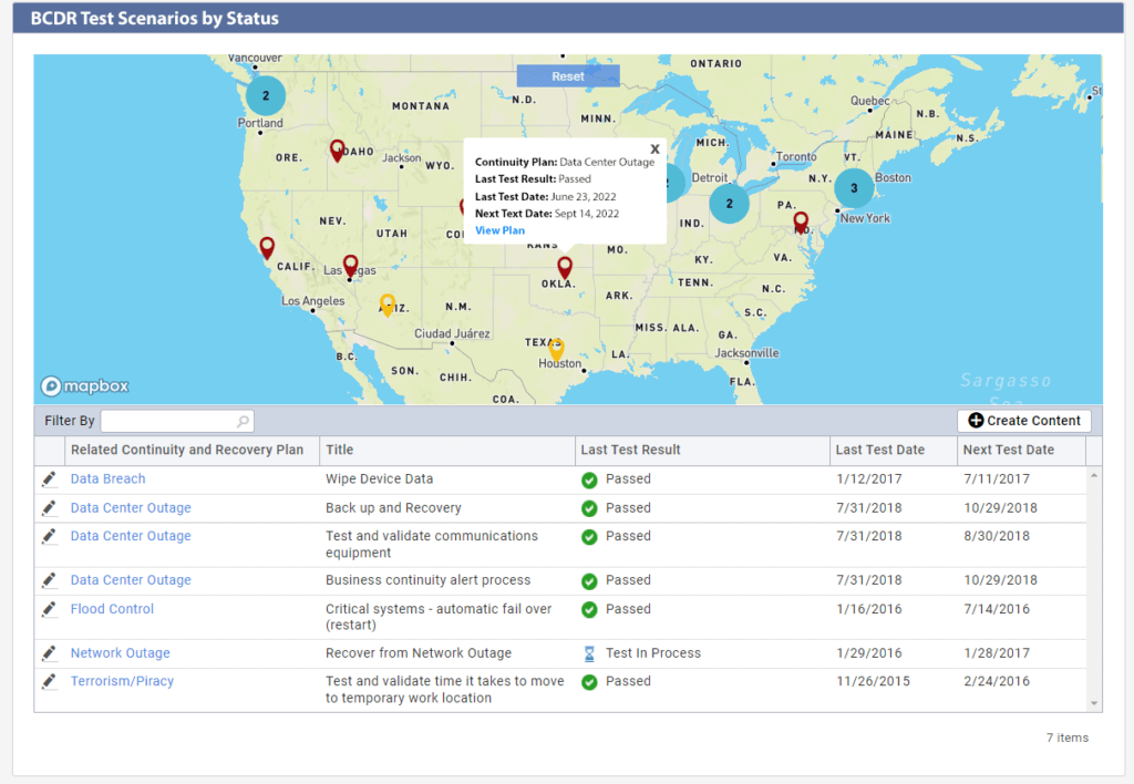
- Custom point colors, such as red points for “failed” results, green points for “passed,” and yellow points for pending, can be a static color, a list field, or a numeric range
- Optional clustering for nearby map points
It’s important to note that you can embed point maps directly into Onspring dashboards to make them visible to everyone who needs them, including stakeholders, risk owners, and even your Board.
Color Coding Your Point Map
To take location points on a map to a whole new level, you can color-code points based on values from fields in Onspring.
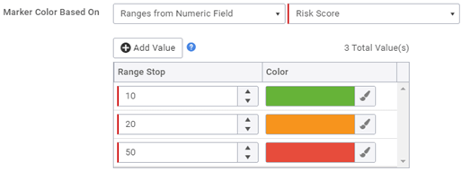
Since you can assign a color to the pin from an array of values, you may choose to trigger a color change when the location’s risk likelihood changes, which can alert you to watch for possible risk trends in an area. You can dive into the specific record information for more context to a risk fluctuation straight from the point.

Below is an example of how you can use numeric ranges in your data sets to color code points on your map. In this particular example, the color ranges signify predefined risk tolerance levels, enabling the user to see risk by geography.
How can a point map be used?
Now that you know how a point map works, let’s explore a few examples where point maps can be used to help you generate insights from geographic data.
Business Continuity Management
When an issue related to your business operations occurs, you need to know immediately the areas affected, including which vendor, asset, data center, distribution center, etc. are impacted.
Being able to geographically map disruptions in your business can be critical when you’re looking to understand root issues and vulnerabilities. Location-based data visualizations can help you solidify existing business continuity plans to avoid disruptions in the future.
Onspring point maps provide this exact visibility.
And with Onspring’s real-time reporting nature, when your business continuity plans activate, your point map reflects current data, so you always have a pulse on disaster recovery status or continuity plan execution by location.
Incident Management
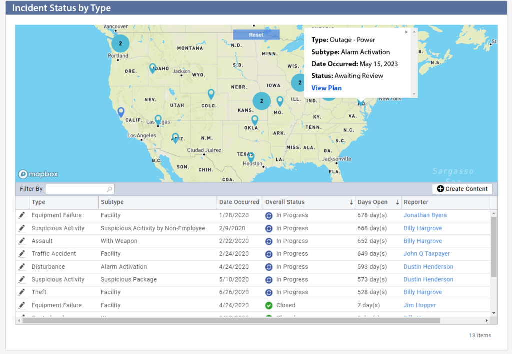
Point maps provide excellent visual displays of information when you want to see where incidents are occurring in your business and what incidents still need to be resolved.
Instead of using a standard bar or pie chart, add another layer of context to your data analysis by mapping incidents by geography and color-coding data points by status: open, in progress, and resolved.
Color coding incident management data in a point map can help you track the progress of each stage of the incident resolution lifecycle and the impact of each action taken by different stakeholders. This added layer of context helps provide complete transparency, so everyone knows what is happening and where, so you can get to why.
Incident management in point maps can be used for any type of incident, including IT incidents, operational incidents, social incidents, and more.
Vendor Management
Point maps are a great reporting tool in vendor management and can be utilized to analyze data across many different vendor angles, including risk profiling, onboarding process reporting, sourcing, and more. In this example, we explore how point maps can improve vendor management from a risk and environment, social, and governance (ESG) angle.
You can use point maps in your vendor management program is by evaluating geographic data to analyze the potential impact of climate factors. With a geographical view of your supply chain, it is much easier to evaluate potential issues in the event of rising sea levels, hurricanes, or wildfires.
For example, suppose you want to evaluate which vendors reside in or near coastal areas prone to hurricanes. Point maps will plot all vendors who have been identified as having at-risk operations due to their proximity to hurricane zones. Adding color-coding to this data can tell you which of those vendors are in Tier 1 of your supply chain and critical to your business.
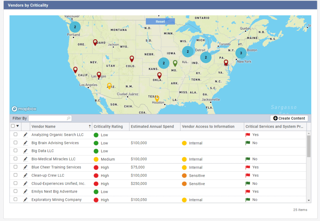
This data can all be connected to your business continuity plans in Onspring and even instigate reviews between vendor managers and the vendors to discuss plans for upcoming seasons that may be impacted by extreme weather.
Point maps in Onspring provide a simplified method to track changes over time. For example, if you have coast-to-coast manufacturing sites, color-coded point maps can alert you to rising material costs in the Northeast, say, over the last two quarters. Like heat maps, you can set up different thresholds such as inventory levels and processing times, with green being good and red meaning risk. You could then drill into the high-risk areas to formulate your incident management prevention or remediation activities.
Using point maps in Onspring, you could quickly set criteria that identify higher costs or changing risk levels by city, state, country, or even counties and states during election periods. This information offers insight for your business decisions, particularly when making decisions on local, regional, national, and global levels.
Plan Distribution Center Locations
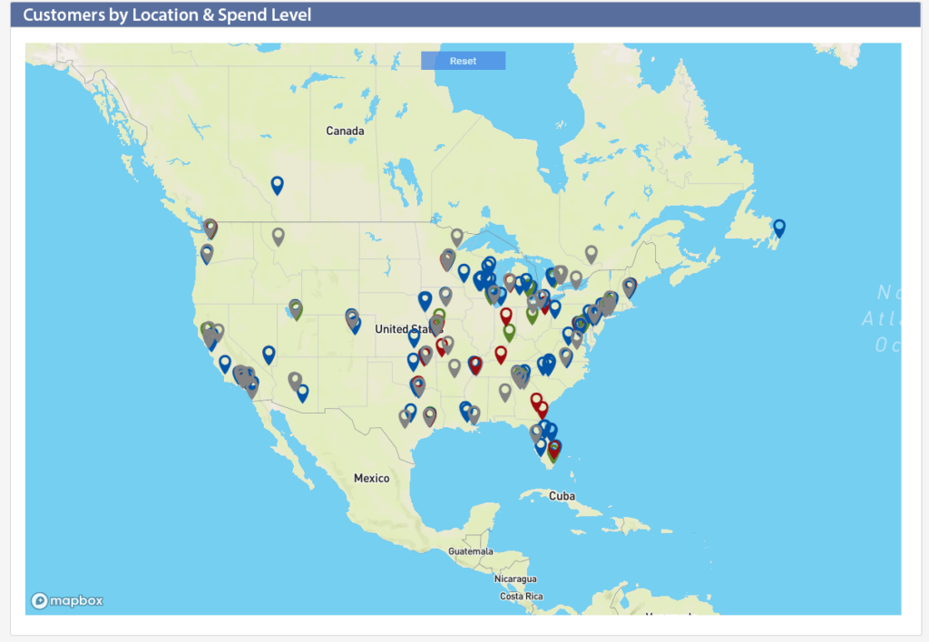
If you’re a national retailer, plotting customer addresses can make identifying optimal distribution sites easier, which, in turn, makes for faster and cheaper delivery services in the long run. Our point mapping report can help you determine where to put your retail locations or distribution centers. Geospatial analysis helps retailers find the best places for store locations based on population density, average income, and traffic patterns, to name a few.
Since Onspring automatically turns address data into geographic coordinates, you can quickly map the exact location of every customer and configure it to show their related sales or inventory trends over time. This visual snapshot also helps you identify any unusual changes in customer behavior or location preferences.
Automate the Point Mapping Process
Once you configure Onspring’s point map settings the first time, any additional record will be automatically generate a point on your map—complete with designated information. Anytime you change an address or select a preference for a secondary address, the record is automatically re-geocoded and updated on your map or maps. Remember, all of this is done with a few clicks in Onspring without the help of IT.
Have a contact or customer spreadsheet listing hundreds of addresses? In Onspring, all you have to do is upload the spreadsheet to create individual records (with addresses) reflected in your point map. You can use any excel files or .csv files for data imports!
Take healthcare providers assessing high-risk patients, for example. In this case, point maps can provide an accurate picture of the actual geographic population at risk. You could layer in whether or not individuals were seeking treatment to determine where healthcare providers could potentially target prevention efforts for higher-risk areas.
Summary
Point mapping is a great way to visualize your business’ efforts and opportunities. You can visually display influential metrics by geocoding data, such as traffic levels, sales performance, customers, competitors, or employees. Onspring’s point map tool lets you easily color code and view key metrics on a map and make changes to improve performance. Point mapping makes it easy to see where your business is doing well and where you need improvement.


